Blog Post One: Visualizing the Effects of Gerrymandering
September 15, 2022
Introduction
Hello! Welcome to my first weekly blog entry. This series will present statistical models that describe and predict the 2022 congressional midterm elections. This first entry, though, will present a few visualizations that draw insight into the effect of gerrymandering on elections in the early 2000s.
Gerrymandering – the creation of voting districts whose geographies give one party an electoral advantage over the other (see this explanation for more) – has been a salient topic both in the political discussion and in our nation’s courts. Both political parties have utilized this tactic - it seems that the most recent round of redistricting has benefited the Democrats, but in previous decades the Republicans have tended to benefit more. To investigate the effects of gerrymandering, we can compare the vote share (the percent of votes that one party receives) to the seat share (the percent of seats in Congress that the party ends up holding) in an election. If a party receives (proportionally) more seats than votes, it has benefited from gerrymandering; if it receives fewer seats than votes, it has suffered from gerrymandering; and if the two percentages are roughly equal, then the electoral districts are roughly representative of the population.
The 2002 Midterm Election
The election we will primarily investigate in this blog post is the 2002 midterm election. This election is interesting because in a typical midterm, the party of the incumbent president tends to lose seats in the House of Representatives. In 2002, however, President Bush was extremely popular (due to his handling of the September 11th terrorist attacks), and his Republican Party actually gained 7 seats in the House. 2002, however, was also the first election year after congressional districts were redrawn following the 2000 census. So, we might ask the question: did Republicans have such an atypical gain in the House completely because of President Bush’s popularity, or did gerrymandering have something to do with it?
To answer this question, we will use data on the votes and seats won in the 2002 election in each state, curated by the Harvard Kennedy School. The data can be found here. Slight adjustments were made to the data to re-code the congresspeople who are technically independents but reliably caucus with one of the major parties (Bernie Sanders, for example).
Nationally, Republicans won 229 of the 435 seats in the House of Representatives, or roughly 52.6%. As the nationwide Republican vote share (among those ballots that voted for one of the two major parties) was roughly 52.4%, it seems that this election was actually pretty representative of the country’s tastes. Let’s examine state-by-state, to see if we can find anything interesting. Below is a comparison of the vote share by state (on the left) and the seat share by state (on the right) that the Republicans attained in this election. Both maps use the same color scale, where a “hotter” shade of red corresponds to a larger percent. So, if there are many states that are “hotter” on one map than on the other, we might conclude that gerrymandering either helped or hurt the Republicans (depending on which map is the “hotter” one).
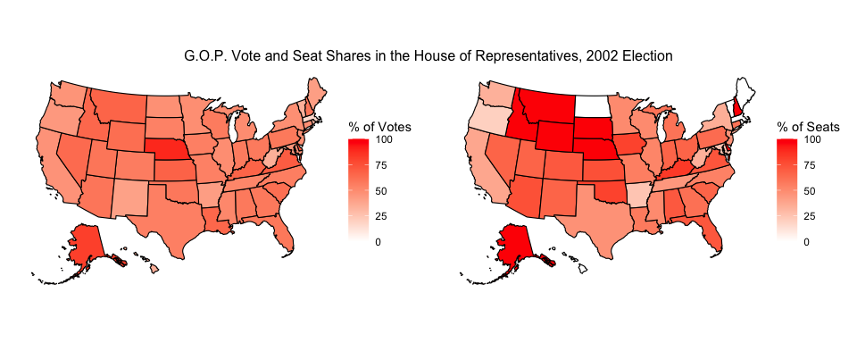
There certainly appear to be more states whose G.O.P. seat shares are “hotter” than the corresponding G.O.P. vote shares. We see this across the west, midwest, and south. So, why are the nationwide seat and vote percentages so close? Well, there are a smaller number of states, mostly located in the northeast, where the Democrats won proportionally more seats than votes. These states (for example, New York, Massachusetts, and Maryland) tend to be larger than the states in which Republicans won more seats than votes. In aggregate, the two effects offset each other.
Comparing to the 2000 Election
Based on that pair of visualizations, we might conclude that the effect of gerrymandering after the 2000 census was somewhat minimal. While electoral maps favored Republicans in more states than Democrats, the states in which Democrats were favored tended to be larger. This resulted in an overall balance between the two parties. To see if the redrawn maps had much of an impact at all, we might compare the 2002 election to the 2000 election, the last election that used the district maps from before the 2000 census.
In this election, Republicans maintained control of the House (though they did not significantly increase the number of seats held). They won 222 of the 435 possible seats (roughly 51%), despite only taking roughly 50% of the vote. This is a larger discrepancy between vote share and seat share than we saw in the 2002 election, but the percentages are again pretty close, which indicates that the election was fairly representative of the country’s preferences. Below is a comparison of the difference between the seat share and the vote share in each election, with 2000 on the left and 2002 on the right. Both maps use the same color scale, where blue indicates Republicans winning far fewer seats than votes and red indicates Republicans winning far more seats than votes.
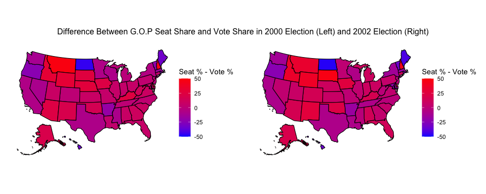
These two maps are almost identical! There are a few states in the west that got redder, and a few states in the northeast that got bluer, but overall most states remain a similar shade of purple between the two years. From this, we might conclude that the redrawing of congressional districts following the 2000 census did not disproportionately benefit either party, as compared to the existing maps.
The implication of all this is that we can answer the question we set out to answer. Republicans did so well in the 2002 midterms not because they simply took advantage of gerrymandering to win proportionally more seats than votes. There is not very much evidence to support that claim. Rather, it appears that their atypical performance in the midterms was in fact reflective of the country’s preferences and President Bush’s popularity at that time.