Blog Post Two: Using the Economy to Make Predictions
September 19, 2022
Introduction
It is well-established (by Healy and Lenz, for example) that in presidential elections, the recent state of the economy is a strong predictor of the national vote share. However, in a preliminary analysis, a model using the most recent quarter’s GDP change to predict the nationwide popular vote share in congressional elections was shown not to be very powerful. How might we attempt to bridge the gap between these two results? Well, perhaps when considering the election of their representative in Congress, voters do not consider the United States’ economy at large; rather, they consider a more localized measure of economic performance. This would make sense, because Congressional representatives are tasked to specifically advocate for their constituents, so the implication of this model is that voters are holding representatives accountable only to their job description. Let’s see how well this model, and extensions of it, perform.
Using Statewide Unemployment to Predict Statewide Vote Share
The base model that this blog post will consider uses the statewide unemployment rate to predict the vote share achieved by Democrats in that state. We consider the vote share achieved by Democrats in this model because, as per Wright, voters tend to think about unemployment as an issue that Democrats “own,” as opposed to a metric upon which the incumbent should be either rewarded or punished. Data on statewide unemployment rates is given by the BLS. In calculating the vote share, we consider only those ballots that were cast for one of the two major parties. We also do not consider those elections in which a third party won more than 10% of the popular vote, as they might obscure the dynamic we are attempting to uncover between the two major political parties.
Below are scatterplots for two variations of this model. The scatterplot on the left uses the percent change in the unemployment rate between Q7 and Q8 as the independent variable, whereas the scatterplot on the right uses the Q8 unemployment rate as the independent variable. Both scatterplots include dashed lines at the median values for each variable (to get our bearings around the plots), and the fitted regression lines with shaded 95% prediction intervals. Both plots exhibit a very, very weak positive correlation. This does technically agree with the model that Democrats tend to gain votes when unemployment is high because they “own” the issue, but the correlations are tiny (both less than 0.2), and it also seems that the presence of outlier points “carry” the correlations. The majority of the data in both plots is concentrated in the middle, and there is a very large variation in the vote share achieved by Democrats for any fixed unemployment rate. So, neither model is very good. One interesting thing is that voters seem to react more to the unemployment level at the time of the election than to the percent change from the previous quarter. This is indicated by both a higher R-squared (0.015 vs. 0.0026) and a higher slope t-statistic (4.2 vs. 1.7) for the right regression vs. the left regression. The implication is that voters perhaps only care if unemployment is currently high, regardless of if it used to be much higher or much lower.
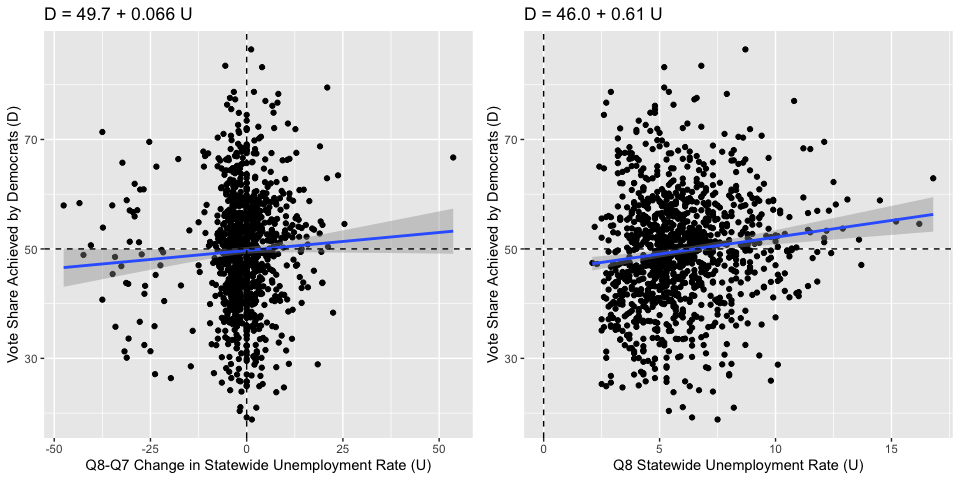
The problem with these models is that obviously unemployment alone won’t explain the vote share that went to Democrats in every state, because some states have more liberal constituencies than others. It may be the case that above average unemployment does cause above average votes to Democrats, but each state has a different calibration of what the “average” vote share to Democrats would be. In the base model, we are comparing apples to oranges.
Incorporating State Heterogeneity and the President
We will now consider an improved model, one which takes that factor into account. We will consider the statewide vote share for Democrats in the previous election, which gives a good indication of how liberal or conservative the state is (and also reflects autocorrelation between successive elections). We will also consider the structural effect that the party of the sitting president has on the congressional election, as congressional elections are often seen as a referendum on the performance of the president. We will allow the party of the sitting president to interact with the Q8 unemployment rate in our model. This essentially gives the line a different slope when the sitting president is a Democrat, in line with Wright’s findings that voters reward/punish other politicians for unemployment differently depending on whether the sitting president is a Democrat.
Below is a scatterplot that compares the predicted vote share to the actual vote share, and a dashed line indicating where the two would be equal. Clearly, the fit of this model is much better than before - the R-squared jumps to over 0.6, indicating that just over 60% of the observed variation in the vote share for Democrats can be explained by this regression model. Moreover, below is also a histogram of the residuals of this model. The overlayed curve is a Normal density curve, revealing that the residuals are indeed approximately Normal and our prediction intervals and standard error estimates are statistically valid.
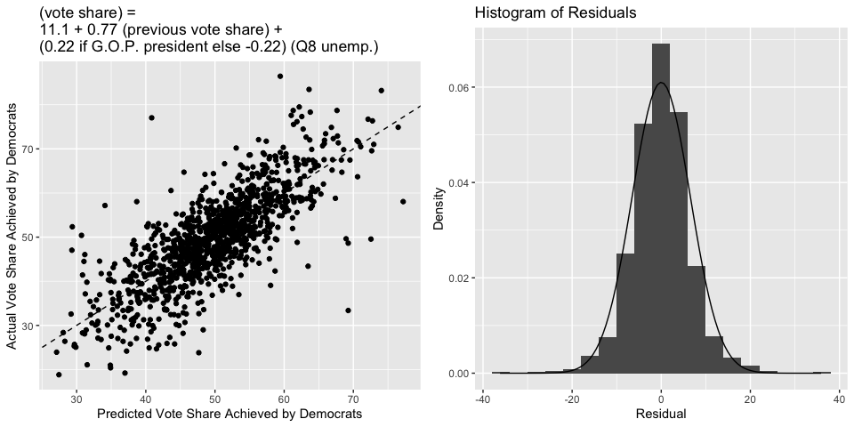
This model is certainly an improvement to the model from before, and is also an improvement to the model that simply used national measures of economic performance, but it is far from perfect. The standard deviation of the residuals is 6.54, and this agrees with a bootstrapped cross-validation estimate of the root mean squared error of this model (which is 6.55). So, a typical deviation between this model’s prediction and the actual vote share achieved by Democrats is around 6.5%, which is certainly enough to flip the tide of an election. Moreover, the coefficient for unemployment in the model has a magnitude of around 0.2. So, an unemployment of 10% (which is pretty high) will only swing the predicted vote share of Democrats by around 2%. This isn’t negligible, but it is certainly less than the variation we see. So, the local economy still isn’t as strong of a predictor of election outcomes as we’d perhaps like it to be.
2022 Prediction
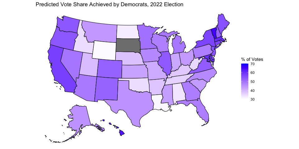
Below is a map that summarizes this model’s prediction of the 2022 election, using the most current available unemployment data (May 2022). South Dakota does not have a prediction because there is no Democrat running in the state. A color closer to blue corresponds to a larger vote share for Democrats, and a color closer to white corresponds to a smaller vote share for Democrats. Below is also a table that gives a 95% prediction interval for each state.
##             state LowerBound Predicted UpperBound
## 1         Alabama       20.7      33.6       46.5
## 2          Alaska       32.1      44.9       57.8
## 3         Arizona       35.8      48.6       61.5
## 4        Arkansas       25.1      37.9       50.8
## 5      California       44.8      57.7       70.5
## 6        Colorado       39.6      52.5       65.3
## 7     Connecticut       44.0      56.9       69.7
## 8        Delaware       42.5      55.3       68.2
## 9         Florida       35.1      48.0       60.8
## 10        Georgia       35.2      48.1       60.9
## 11         Hawaii       50.7      63.6       76.5
## 12          Idaho       21.7      34.5       47.4
## 13       Illinois       40.8      53.6       66.5
## 14        Indiana       29.0      41.9       54.7
## 15           Iowa       33.7      46.6       59.4
## 16         Kansas       29.8      42.7       55.5
## 17       Kentucky       24.3      37.1       50.0
## 18      Louisiana       18.1      31.0       43.9
## 19          Maine       42.0      54.9       67.7
## 20       Maryland       47.3      60.2       73.0
## 21  Massachusetts       47.9      60.7       73.6
## 22       Michigan       36.2      49.0       61.9
## 23      Minnesota       37.2      50.1       62.9
## 24    Mississippi       30.6      43.5       56.3
## 25       Missouri       28.6      41.5       54.3
## 26        Montana       31.2      44.0       56.9
## 27       Nebraska       25.3      38.1       51.0
## 28         Nevada       36.5      49.3       62.2
## 29  New Hampshire       39.2      52.0       64.9
## 30     New Jersey       41.9      54.7       67.6
## 31     New Mexico       39.2      52.1       64.9
## 32       New York       44.0      56.9       69.7
## 33 North Carolina       33.5      46.3       59.1
## 34   North Dakota       19.5      32.4       45.3
## 35           Ohio       31.0      43.8       56.7
## 36       Oklahoma       21.6      34.5       47.4
## 37         Oregon       41.3      54.1       67.0
## 38   Pennsylvania       35.1      48.0       60.8
## 39   Rhode Island       42.4      55.3       68.1
## 40 South Carolina       30.7      43.6       56.4
## 41      Tennessee       23.3      36.2       49.0
## 42          Texas       32.0      44.9       57.7
## 43           Utah       25.9      38.8       51.7
## 44        Vermont       52.5      65.4       78.3
## 45       Virginia       40.5      53.4       66.2
## 46     Washington       41.2      54.0       66.9
## 47  West Virginia       22.3      35.2       48.1
## 48      Wisconsin       34.9      47.7       60.6
## 49        Wyoming       17.7      30.6       43.5