Blog Post Seven: Pooled Models
October 26, 2022
Introduction
In this blog post, I will critically consider the modeling choice of using one pooled model for all districts vs. individual models for each district, before updating my prediction of the 2022 midterms.
To Pool Or Not To Pool
There are advantages and disadvantages to the pooled model approach. A pooled model uses data from all districts to fit one prediction function that applies to all districts, so it essentially learns the commonalities between districts. This means that it is less sensitive to the idiosyncrasies that might be present between districts, so we have to hope that the districts all respond to the predictors in a similar manner. However, this additional assumption allows us to model correlations between districts (which district-specific models do not include), and it also allows us to be more efficient with our data usage (since the same amount of data is sent to a single model instead of getting split into 435 models).
On the other hand, an unpooled model uses data from one particular district to fit a model that predicts outcomes for that particular district. This means that it picks up on the specific patterns exhibited by that district, but is reliant on a much smaller data set. If the data set is too small, we might end up overfitting to the noise without actually parsing out the true trend. However, if the data set is large enough, we can learn about the specific behavior of this district without getting “distracted” by what other districts tend to do. When we have reason to believe that different districts behave quite differently, this works in our favor.
Last week and in previous weeks, we have actually only considered pooled models. We haven’t, though, made that choice with proper justification up to this point. So, we will now investigate which factors are best to pool and which are best to leave unpooled, before updating our prediction for 2022.
Autocorrelation
One of the most predictive features in my previous models has been the outcome of the previous election. This is for good reason - intuitively, without any other information, a natural guess for what will happen in an election is what happened in the most recent election. In our linear models, the Democrat vote share of the previous election has a coefficient that is related to (but not exactly equal to) the “autocorrelation” of this variable - quantifying how well the previous election predicts the next election. An autocorrelation closer to 1 means that the next election is perfectly determined by the previous election, and an autocorrelation closer to 0 means that the next election is completely unrelated to the previous election.
Our pooled models imply that the different districts have similar values for this autocorrelation. In other words, that each district has the same dependence on its previous election outcome. But is this grounded in truth? To investigate, we will calculate the autocorrelation value for each district, and then examine how spread out the resulting distribution of autocorrelations is.
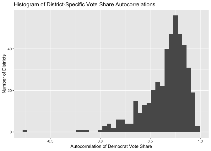
This distribution is pretty spread out! The majority of the autocorrelation values are clustered around 0.75, but this clustering is not very tight. Some districts have autocorrelations very close to 1, some districts have autocorrelations very close to 0.5, and a handful of districts have autocorrelations that are close to 0 or are even negative! This means that our pooling assumption - that the different districts respond similarly to this variable - is invalid. So, in this model update, we will include the previous vote share in an unpooled model.
At this point, might wonder if there are regional patterns in these autocorrelations. That is to say, maybe the variation of these autocorrelations exists on a larger regional scale. To satisfy this curiosity, as a quick aside I map the autocorrelation value for each district (ignoring those autocorrelations below 0.5 to make the color scale more granular), in order to see if any regional patterns emerge.
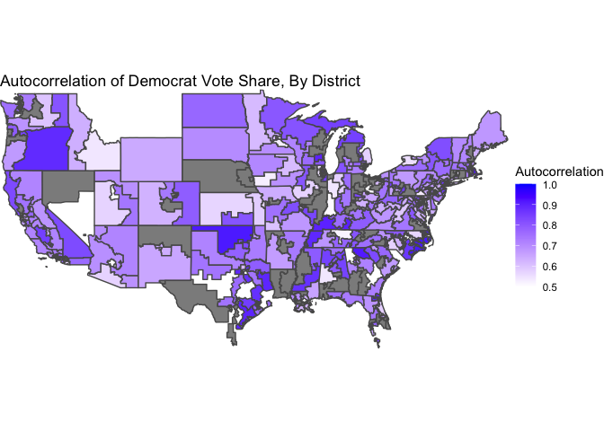
The districts definitely tend to have a color similar to their neighbors, but broad regions of the country do not seem to align in general.
The Economy
Measuring the effect of the state of the economy on election outcomes is something we have grappled with for a while. We’ve seen great support for the inclusion of this factor in the literature, but more nebulous results in our investigations when we moved the analysis of this factor from the state level to the district level. Perhaps this happened because different districts within each state have different sensitivities to this factor, so it was inappropriate to use a pooled model in this case. To investigate, I calculate the regression coefficient for Q4 unemployment for each district, in a bivariate model that includes Q8 unemployment and the district’s previous Democrat vote share as independent variables. I also report the t-statistic for each coefficient.
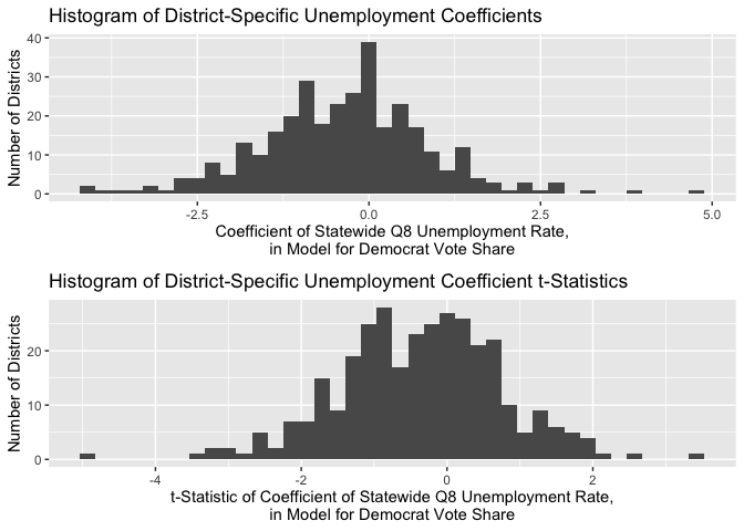
As we can see, the different districts have wildly different coefficients, centered around an average coefficient of 0 (indicating no effect for this variable!). Moreover, the vast majority of t-statistics on these coefficients are between -2 and 2, indicating statistical insignificance. The same results occur when we consider the Q7-Q8 percent change in unemployment. For this reason, we will exclude the state of the economy as a factor in both our pooled and our unpooled district-level models. In the future, though, we will think about ways to incorporate the state-level models (that demonstrated a more successful application of this variable) into our final prediction.
The Case For The Other Variables
Another predictive feature of our previous models has been the results of the generic ballot poll. We have pooled this variable across districts in the past, but we have reason to believe that this choice was unwarranted. The generic ballot represents the average voter, and it does not make sense to assume (in a pooled model) that the different districts are equally representative of the average voter! Some districts skew much more liberal, and others skew much more conservative, and we would expect these two cases to exhibit different sensitivities to the generic ballot. So, due to this theoretical consideration, we will include the generic ballot only in unpooled models this week.
We also included in our models structural factors (like incumbency, the party of the president, and the status of midterm vs. presidential election) and expert ratings. We keep these structures in a pooled model, due to practical limitations of our data. For many of the districts for which our data on these factors is complete, there is not very much variation in these variables. A district will tend to have a similar expert rating election-to-election and a similar incumbent party, for example. So, in isolating each district for an individual model, we would likely not have the variation necessary to tease out robust coefficient estimates. So, we resort to a pooled model, where we can take advantage of all of our data to learn the similarities between districts with respect to these factors.
Model Update and 2022 Prediction
So, we are now ready to update our model. We will consider a pooled model consisting of the Inside Elections rating and election structural factors as predictors, and individual models consisting of the district’s previous vote share and the generic ballot as predictors. To make our final prediction, we will ensemble the two models by taking the simple average of the predictions. In the future, we will read up on more sophisticated ways to choose the ensemble weights!
Here is a scatter plot comparing the Democrat’s predicted success probability given by the GLM model to the actual vote share they achieved. This model is pretty successful - the two main groups of points are where both the success probability and the vote share are above 50%, and where both the success probability and the vote share are below 50%. Only for a few points does the election outcome disagree with the success probability.
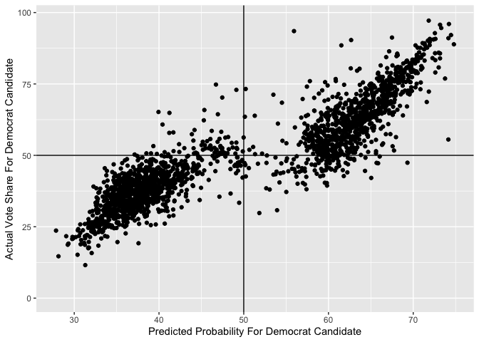
I also calculate a bootstrapped estimate of the out-of-sample misclassification rate, using only 10 bootstrapped samples (since the fitting procedure takes very long). The estimate for the misclassification rate is just under 9%, which is pretty low! This means that we expect our model to correctly predict the win/lose result of 91% of districts.
Now, I can update my prediction for 2022. In the same manner as last week, I get the most currently available values for today’s data. I use the same heuristics for noncompetitive districts, assuming that the unopposed candidate has a success probability of 100%.
Here is a map of the predicted success probabilities, by district. The grey districts are uncontested, and excluded so that the color scale can be more granular.
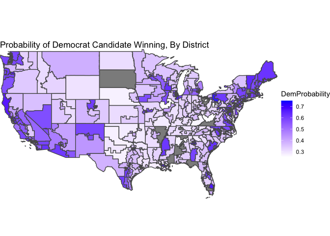
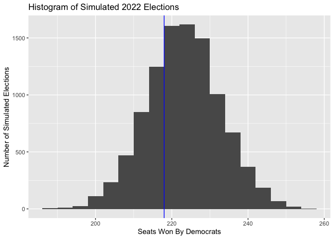
For the final seat-share prediction, this model has Democrats winning an expected value of 223 seats, or 51%. Our expectation of the performance of Democrats has increased compared to last week. Is this due to our inclusion of unpooled models? More likely, it is due to our exclusion of campaigning and turnout, which we concluded last week tended to actually give Republican congressional candidates the advantage. So, in the future, we should think about ways to bring this data back into our models even though it is widely missing.
We can again understand the uncertainty of our prediction via simulation. Below is a histogram of the Democrat performance in each simulated election, with a vertical line denoting a majority of seats.