Blog Post Nine: Midterm Prediction Reflection
November 22, 2022
Introduction
In this blog post, I will review the predictions of my final model for the 2022 midterm elections, analyze patterns in its accuracy/inaccuracy, and offer hypotheses explaining those patterns.
Review of Model
Model Architecture
My final model consisted of two pieces.
The first piece was an unpooled statewide model, predicting the Democrats’ vote share based on the economy, the generic ballot, the state’s previous vote share for Democrats, and structural election factors. These predictions followed the form
V̂i = logit(β0, i + (β1, iX1, i+β2, i)X2, i + β3, iX3, i + β4, iX4, i + β5, iX5, i)
where V̂i is the predicted vote share (for Democrats) in the ith state, each β is a coefficient, and each X is a variable. The subscript i on all the coefficients denote that this model allows each state to have its own coefficient. X1 is an indicator for whether the sitting president is a Democrat, X2 is the Q8 unemployment rate for the state, X3 is the results of the generic ballot poll (averaged over the month preceding the election), X4 is the state’s previous vote share for the Democrat candidate, and X5 is an indicator for whether the election is a midterm or not (where the sign indicates whether the sitting president is a Democrat or a Republican, since voters tend to punish the incumbent in midterms, not a particular party).
The second piece was a pooled district-level model, predicting the Democrats’ vote share based on expert ratings from Inside Elections and the Cook Political Report, demographic data, the incumbent’s ideological positioning as measured by DW-NOMINATE scores, and structural election factors. These predictions followed the form
V̂i = logit(β0 + β1X1, i + β2X2, i + β3X3, i + β4X4, i + β5X5, i + β6X6, i + β7X7, i)
where V̂i is again the predicted vote share (for Democrats) in the ith district, each β is a coefficient, and each X is a variable. Notice that this time, the coefficients do not have a subscript i, so all districts share the same coefficients. X1 is the average rating from Inside Elections and the Cook Political Report (coded on a numerical scale), X2 is the proportion of the district below the age of 30, X3 is the proportion of the district that is female, X4 is the proportion of the district that is black or hispanic, X5 is the incumbent’s DW-NOMINATE score (the first dimension), X6 is a flag for the incumbency status of the seat (where the sign again codes for Democrat versus Republican, since voters tend to punish the incumbent as opposed to a particular party), and X7 is the same flag from the earlier model detailing the midterm status of the election and the party of the president.
The two pieces were combined via regression stacking, producing an ensemble that predicted the Democrats’ vote share across the entire nation. This final prediction was made with the form
V̂ = α0 + αunpooledSUMstates i(pi V̂unpooled, i) + αpooledMEANdistricts i(V̂pooled, i)
where the V̂’s represent predicted vote shares for the Democrats, with the left-hand side being a nationwide vote share prediction. The α’s represent the ensembling weights, where the pooled model gets one weight and the unpooled model gets another weight. To calculate the nationwide prediction of the unpooled model, we calculated the average prediction across all states, weighted by the state population pi (according to the 2020 census). To calculate the nationwide prediction of the pooled model, we calculated the (unweighted) average prediction across all districts, which was reasonable because all districts have similar populations. The α’s were fitted via regression stacking, finding the values α0 = 0.09, αunpooled = − 0.3, and αpooled = 1.1.
Model Predictions
The overall model predicted a nationwide vote share for Democrats of 49.18%. This came from an unpooled statewide prediction of 48.4% and a pooled district-level prediction of 49.5%. The actual nationwide vote share achieved by Democrats was roughly (since not all votes have been counted yet) 48.1%.
As the ensemble weights suggest (positive for the pooled model and negative for the unpooled model), the district-level model did indeed overshoot the true Democrat vote share. However, this overestimate was not sufficiently walked back by the unpooled model; the unpooled prediction was actually quite accurate in its prediction of the true Democrat vote share.
The prediction error of the overall model was roughly 1.1%, which is almost exactly the margin of error that we expected based on our bootstrapped out-of-sample estimate of the mean absolute error. We recall that our model was accompanied by a very small margin of error, which we hypothesized differed from the bootstrapped estimate of the error due to correlation between the different races’ errors (since averaging over hundreds of estimates reduces the standard deviation if those estimates are independent). So, in our forthcoming analysis of the model’s accuracy, we will first investigate the correlation structure of the sub-models’ errors, before turning to the overall ensemble.
Analysis of Model Accuracy: Part 1
We will look into the performance of the two sub-components of the overall model, paying particular attention to any correlation that appears in the errors of the individual predictions.
The Errors
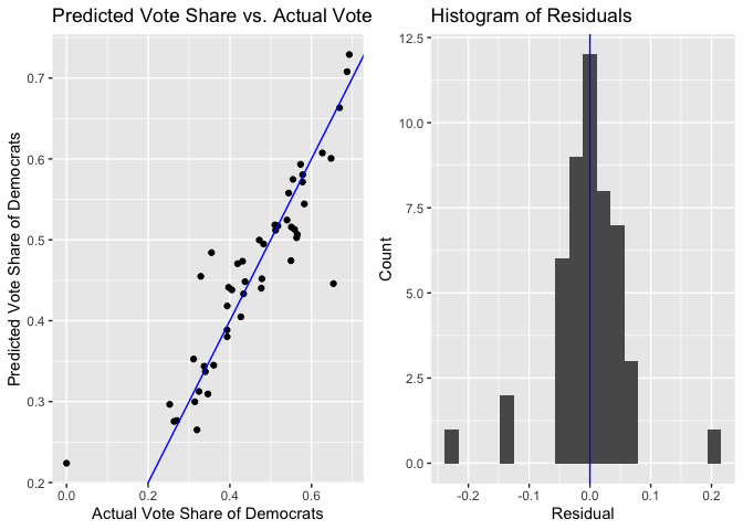
Here are charts that investigate the prediction error of the unpooled, statewide models.
And here are plots that investigate the prediction error of the pooled, district-level model.
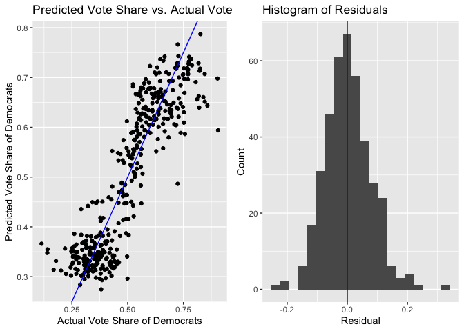
Both histograms of the residuals are roughly centered about 0, indicating that neither model was significantly biased either in favor of or against the Democrats. However, there is a subtle pattern to the residuals, which is revealed by the scatterplots. Even though each model has roughly the same number of positive and negative residuals, the negative residuals are on average farther from the 45-degree line (the line where the residual is 0) than the positive residuals. Visually, we see on both plots that the points to the left of the line are on average farther from the line than the points on the right of the line. This means that when the model overstated how well the Democrat would do in a region (either a state or a district), the degree of overstatement was larger than the degree of understatement when the model understated how well the Democrat would do.
Moreover, the residuals exhibit a correlation that FiveThirtyEight notes is typical of election outcomes. We can see this correlation when we make maps of the residuals, where a blue region (state or district) indicates the Democrat doing better than expected a red district indicates the Democrat doing worse than expected.
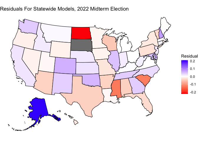
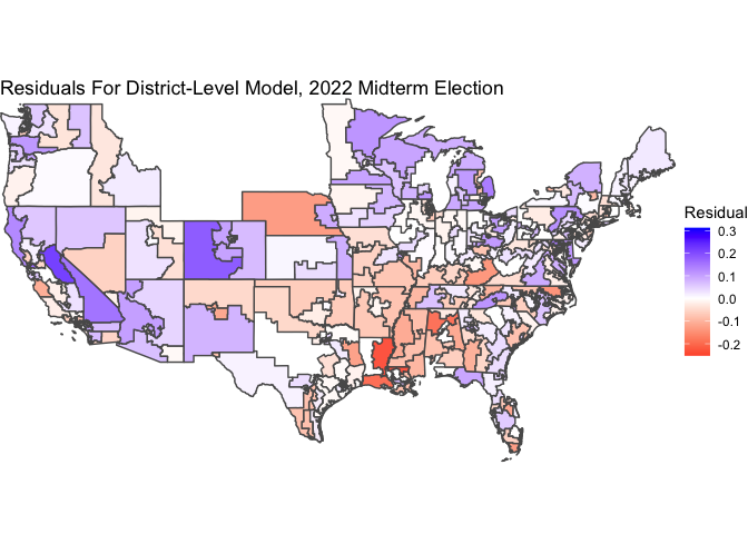
The general (though not perfect) trend is that the red regions (states or districts) tend to be those regions that vote red, and the blue regions (states or districts) tend to be those regions that vote blue. In other words, in regions where the Democrat actually did well, we were overconfident in how well the Democrat would do, and vice versa. Indeed, the residuals exhibit a correlation with the actual vote share of the region. For the statewide models, the correlation between the residual and the actual Democrat vote share was 54%. For the district-level model, the correlation between the residual and the actual Democrat vote share was 41%.
Explaining The Prediction
With that analysis in mind, we are able to put together a story that explains why our overall model slightly overpredicted the Democrat vote share. Our observation of correlated errors revealed that the regions (states or districts) that overpredicted the Democrats’ vote tended to have a characteristic in common: they were the places where Democrats actually did well. We also saw that the errors overpredicting the Democrat vote share tended to be slightly larger in magnitude than the errors underpredicting the Democrat vote share. Putting those two pieces of information together, we conclude that in places where the Democrats actually did well, the model tended to overpredict how well the Democrat would do, and the magnitude of this overprediction was slightly larger than the underprediction that tended to occur in places where the Democrats actually did poorly. With the errors aligning in that pattern, the end result was a net overprediction of the Democrats’ success.
We will now offer a hypothesis of why this pattern occurred, based on what we learned from one of our blog posts!
Hypothesis For That Behavior And Proposed Test
In Week Six, the focus of our analysis was on the air war and the ground game, and its effect on voter turnout. Though the data was messy, we were able to work through it in the districts for which it was available to create a two-stage model. In the first stage, we used data on campaign ad spending to estimate what voter turnout would look like in an election. The logic was that more ad spending (the air war) should correspond to more activity in the ground game, which was shown to effectively mobilize voters to turn out (even though advertisements alone tend not to mobilize voters). In the second stage, we used this estimate of voter turnout in our model for the Democrat vote share, finding a significant coefficient. The coefficient was negative, which we interpreted as the effect of campaigning flowing through voter turnout: for the increase in voter turnout that was driven by campaigns, it seemed that those voters tended to skew Republican.
Beyond showing us an interesting piece of information about the U.S. electoral system (in the past few elections, it seems like Republicans ran more effective campaigns), this analysis takes a step towards diagnosing our problem. The turnout/campaigning term from that model scaled back the vote share for Democrats, which is the high-level ingredient that our final model would have benefited from. We ultimately excluded this factor from our final model, because the data was very messy and was missing in too many places, but I hypothesize that if we had included this factor, it would have improved the fit of our final model.
To test the hypothesis that our model overpredicted the success of Democrats due to the omission of the turnout/campaigning factor, we would ideally want a more complete data set of campaign spending, or perhaps even a better measure of the ground game (like the number of workers/field offices stationed in each region of the country). We would then be able to include this factor in our model, and see if the bias lessens in severity. Instead of retraining the model, we could simply see how the residual correlates with the turnout/campaigning factor. If the correlation were large, it would mean that the turnout/campaigning factor explained the residual very well, which would mean that including it in the model would have lessened the prediction error. On the other hand, if the correlation were small, it would mean that including the turnout/campaigning factor would not have improved our model.
We have an initial reason to believe that including the turnout/campaigning factor would have improved our model, because the primary driver of the correlated errors was the political leanings of the region (state or district), and this underlying factor should not be very correlated with the turnout/campaigning factor (because there are competitive and noncompetitive regions on both sides of the political spectrum!). So, we hypothesize that including the turnout/campaigning factor would have affected both groups roughly equally, leading to an overall decrease in the predicted Democrat vote share (pushing our model in the right direction). With access to better data, though, we could test this theory.
Analysis of Model Accuracy: Part 2
Having investigated the primary worry of our model, we will quickly investigate how the ensembling procedure could have led to another source of error.
To determine the ensemble weights of our final model, we used regression stacking. This fit the α’s using OLS on the pooled and unpooled predictions on previous election years. However, there were only five elections available for us to train our model on. So, perhaps the estimates for α were unstable in some way.
To test this, we determine the α’s again, using the 2022 election as a sixth datapoint. We find new estimates that are only slightly different: α0 = 0.05, αunpooled = − 0.2, and αpooled = 1.1. These α’s are very close to the original α’s, and even though they do in fact improve the predicted Democrat vote share (the new 2022 prediction is 48.91%), the improvement is pretty nominal compared to our original prediction of 49.18%.
So, this hypothesis for our model’s inaccuracy was that because we only used five datapoints to determine our ensemble weights, we unluckily got a set of α’s that were not reflective of real life. Fortunately, we were able to test this hypothesis by re-estimating the ensemble weights using a sixth election, and we found that even though this would have improved our prediction, it would not have improved it by a drastic amount. It seems that the errors identified in the previous section are the larger cause for concern.
Conclusion
From this analysis, I draw three main takeaways for how I could have improved the model were I to do it again.
First of all, I might have included the turnout/campaigning factor in the model. We saw in a previous week that this factor was predictive of election outcomes, and we hypothesize in this blog post that it could have explained some of the prediction error that our model faced. The data on this was messy, but perhaps devoting more time to cleaning it or to searching for alternative data sources could have brought a fruitful reward.
Second of all, I might have investigated a different ensembling method. Even though we saw that this could be a smaller concern than the problems we identified with the sub-models, it remains the case that we determined ensemble weights with only five datapoints. Perhaps there are more robust ensembling methods out there that I could have investigated.
Finally, I might have looked into the statistical methods that can be used to incorporate a correlated error structure into the model. Even though we hypothesized that including the turnout/campaigning factor in the model could have addressed this to a degree, it is very likely that some other source of error would have then come up, and would have been correlated between the regions as well. FiveThirtyEight takes explicit care to model the behavior of the errors, so that they can forecast an accurate prediction interval as well as a point estimate. This would have been very useful for the uncertainty quantification of my model, because aggregating a bunch of district-level and statewide estimates into one prediction gives a quite unrealistically small standard deviation when they are considered independent estimates. I was able to turn to out-of-sample bootstrapping to nonparametrically estimate the MSE, but it would have been nice to have an accurate parametric estimate as well.